Designing Product and Operations for DaLock’s 4X Growth
DaLock is a self-storage service in Korea. Customers rent units monthly and use an app to access unattended locations 24/7. As the sole product designer, I worked across customer journeys, service policies and operational tools as DaLock expanded from 60 to 240 locations. My focus was to make storage easier to access and use, while supporting revenue beyond unit rentals.
Role / Scope / Years
Product Designer / Product Strategy, UX/UI Design, Design Systems, Rebranding / 2024–2026
Step 1: Keeping Login From Blocking Access
Login Was the Key to the Unit
After joining, I reviewed app-related support inquiries with the operations team. Login, signup and account issues made up the largest share. DaLock locations are unattended, and customers use the app to enter. A failed login could leave a paying customer outside their unit, with no staff on site to help. I treated login as an access problem and made it a priority.
One Entry Point, Clear Next Steps
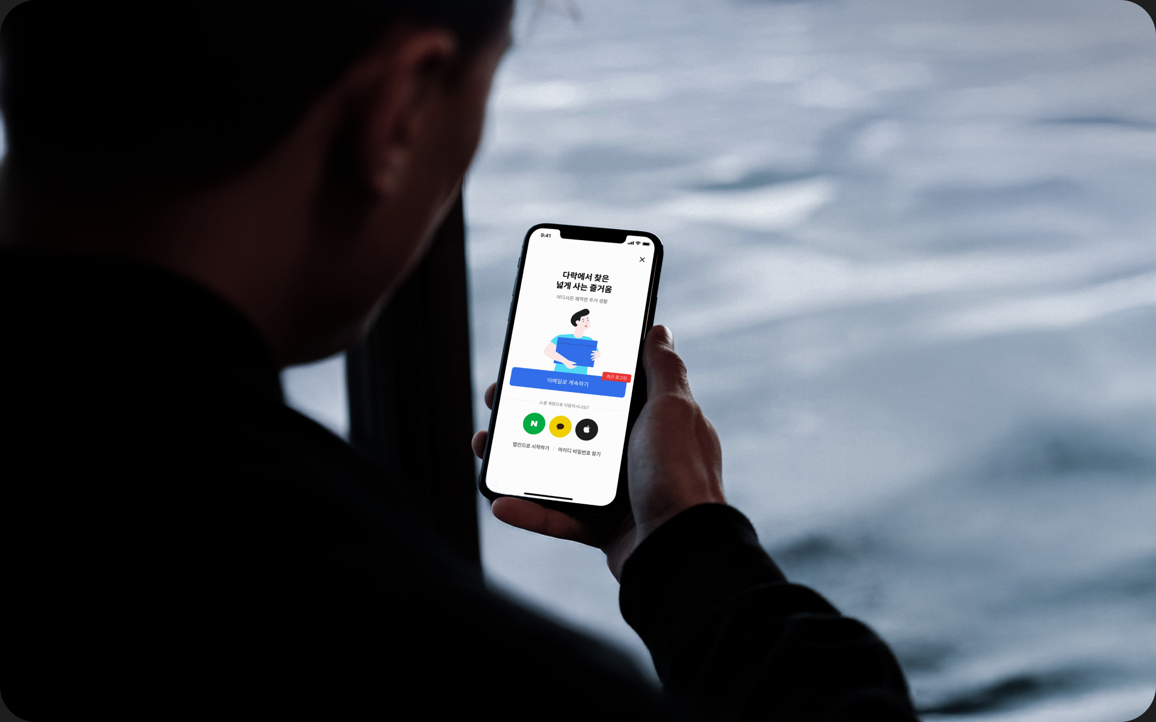
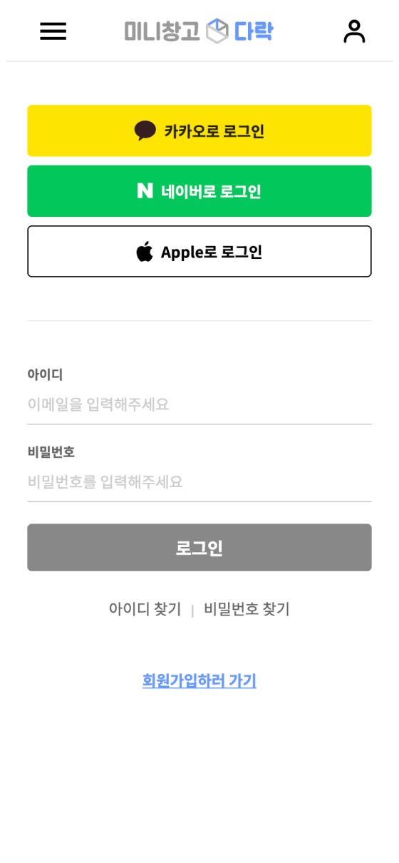
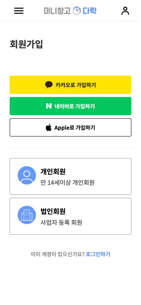
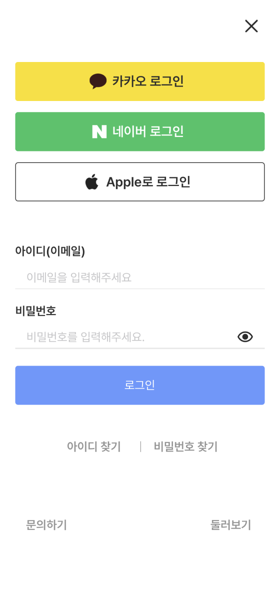
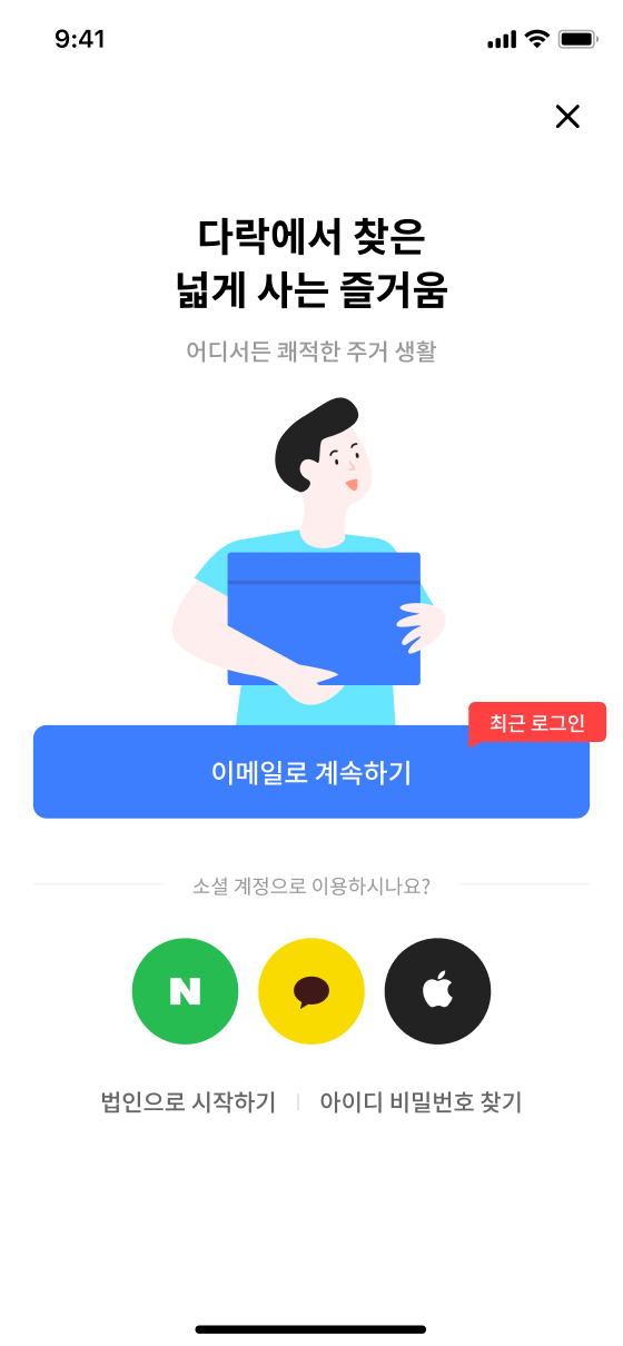
Login and signup screens looked similar across web and app, but their options differed: the app only supported signup through social accounts. Both served the same immediate goal of entering the app, so I unified their starting point. Customers chose a login method, and the flow routed them to login or signup based on whether an account existed.
Web Sign in / Web Sign up / App Sign in

Integrated
The web email signup form had up to 16 fields on one page. Customers could miss a field without realizing it, then abandon signup or contact support. My hypothesis was that a clear next action would reduce missed inputs. I split the form into steps, prioritizing clarity about what to enter next over reducing the number of screens.
All three internal participants completed the usability test without blockers. The small sample helped check for friction in the new flow, but was not enough to establish broader improvement.


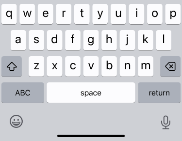
Typing username@dalock.kr reveals the login password field. Typing hello@dalock.kr opens signup, followed by password creation and matching password confirmation.
DaLock was also not a service customers used every day, so expecting them to remember their credentials on every return was unrealistic. I introduced biometric authentication so a return visit would not have to begin with account recovery.


After signup, the customer enables Face ID. A rotating ring surrounds the face icon, followed by a confirmation check.
Fewer Account-Related Support Requests
I compared customer-support inquiries about login, signup and account issues before and after the update. Inquiries in these categories decreased. I also reviewed usage in Clarity for three months after launch. During that period, I did not observe a recurrence of the missed-field issue that had blocked signup.
Step 2: Clear Costs Before the Move
A Deposit Looked Like the Full Price
The paid pickup service had an overall cancellation rate of 56%. Support inquiries and conversations with operations showed that customers mistook the first payment for the full price. The moving partner actually had to review the request in the admin tool before finalizing a quote. “I already paid. Why do I have to pay again?” exposed a mismatch between the interface and the payment process.
An external moving partner prepared each quote. Reviewing requests took staff time and money, so we could not make every quote request free. The service needed a payment before the quote to attract customers with a real intention to book. The ₩10,000 reservation deposit also served as a signal of that intent. We judged that willingness to pay this amount upfront would indicate a meaningful level of purchase intent.
Make Both Payments Clear Upfront
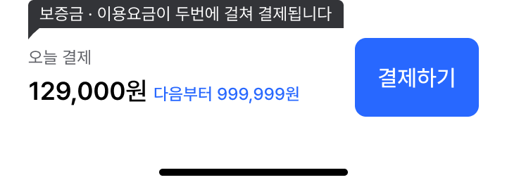
Customers needed to expect the second payment before committing to the first. I separated the fixed ₩10,000 reservation deposit from the balance due after the quote. At the item-size step, I explained that the first payment reserved the service and that the final quote would determine the remaining balance. A KakaoTalk notification then brought customers back to the app to pay the balance and confirm their booking.
BeforeUp-front payment looked like the total.


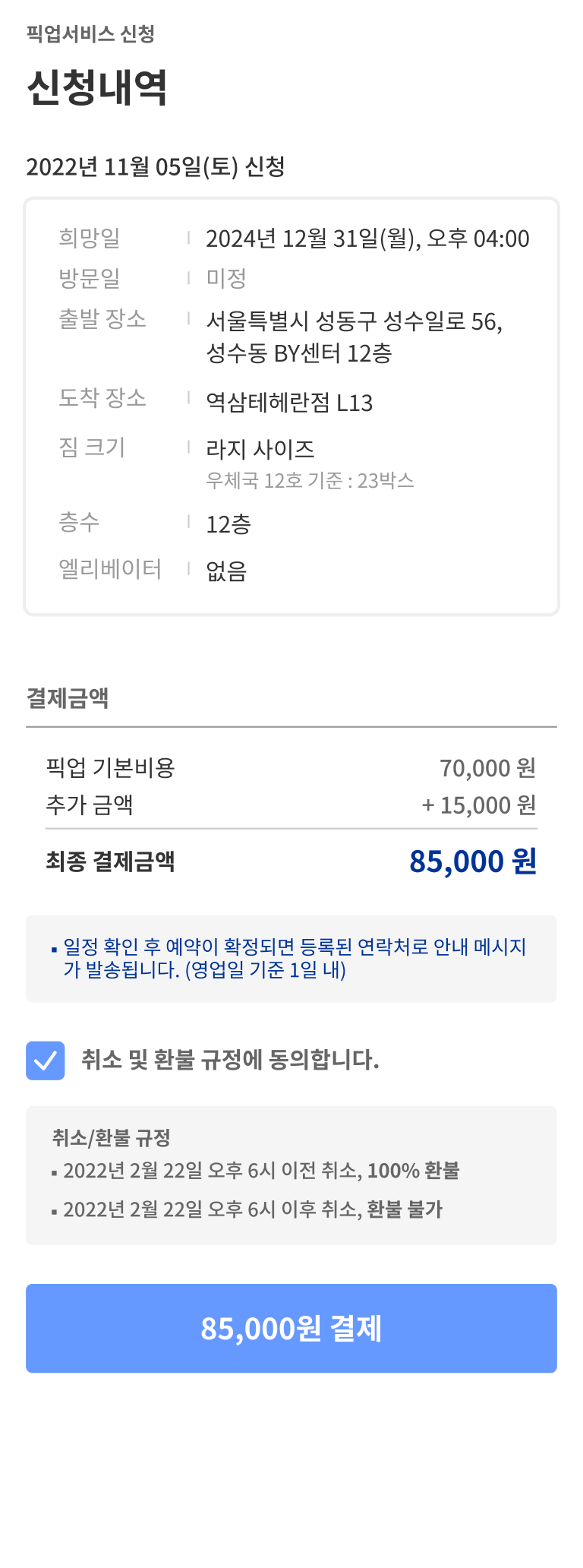

AfterDeposit first. Balance after the quote.
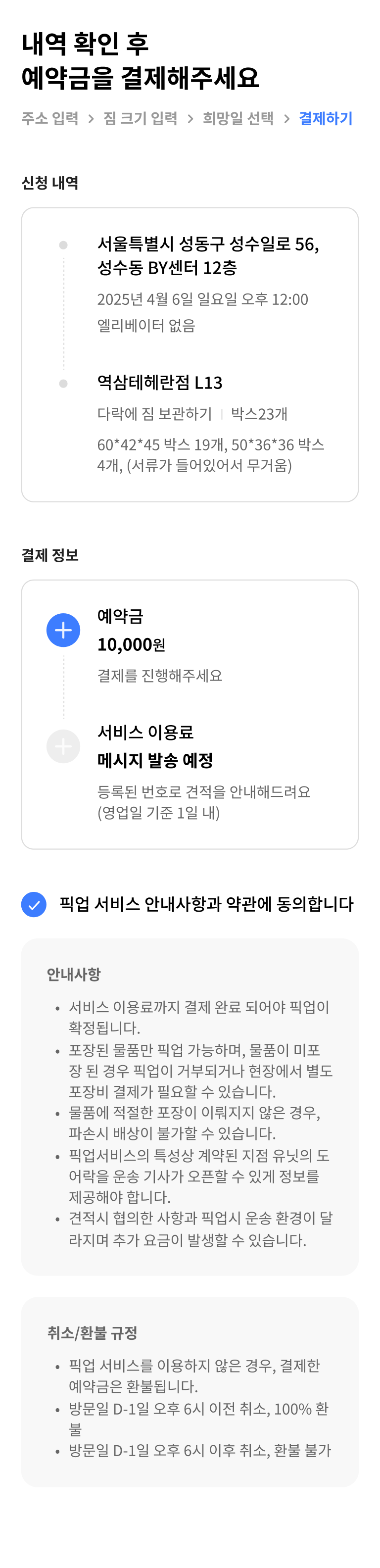
Overall Cancellation Rate: 56% → 35%
After we rolled out the flow separating the deposit from the balance, the overall cancellation rate fell by 21 percentage points. A later CTA change to “Get a quote” saw the application rate rise from 21% to 24%. That CTA result was an early signal and needed further validation.
Step 3: More Revenue From the Same Space
Rental Revenue Had a Ceiling
Each location has a fixed amount of rentable space, limiting rental revenue growth as occupancy rises. Add-ons offered a way to increase revenue per customer without opening more locations. I owned UX/UI and detailed service policies for DaLock Care, a paid service compensating customers for damage to stored belongings, and DaLock Family, which lets others, such as a spouse, share access.
The product owner defined pricing, included features, expected adoption and projected ARPU growth. I designed when to introduce each service, the explanatory copy, and the flows from enrollment through cancellation. Mapping those flows exposed policies that had not yet been defined. I worked through conditions such as when customers could resubscribe after cancelling, then reviewed and agreed on them with the product owner.
Consistent Rules From Enrollment to Cancellation
Previously, customers had to find add-ons in their account pages and enroll separately. I saw unit rental as the moment when they were also deciding who would use the space and which services they needed. I brought enrollment into checkout, showing benefits alongside the added monthly cost. As DaLock Care expanded into tiers, I designed the selection around comparing coverage and monthly fees. Customers needed to understand both the benefit and the recurring cost before choosing.




Add-on subscriptions in the app were tied to physical service access. Cancelling DaLock Family, for example, affected another person’s access permissions. Repeated cancellation and reenrollment made it harder to keep app and on-site access states in sync. The payment system also ran on a monthly billing cycle.
I defined each service period from the billing date up to the next scheduled billing date. Customers who cancelled could continue using the service for the period they had already paid for, but could not reverse the cancellation or resubscribe within that period. They could resubscribe from the next scheduled billing date.
I chose a clear boundary between the paid service period and the next renewal, accepting less flexibility to reverse a cancellation immediately. Customers were told how long their access would continue and when they could resubscribe. Operations and engineering could manage service status against the same billing cycle. The policy accounted for both the payment architecture and the realities of running a physical service.
I applied the same principles to enrollment and cancellation across DaLock Care, DaLock Family and other add-ons. Each product retained the differences it needed, while shared rules reduced the need for customers to learn a new process for every service. I also designed the screens and messages for each policy-dependent state.
ARPU Rose Approximately 5%
As last verified, ARPU rose approximately 5% during the broader add-on rollout and expansion. This reflected the overall expansion, not an isolated measurement of the final checkout redesign. I later introduced a home screen so existing rental customers could also discover new add-ons.
Step 4: A New Home Screen, a New First Impression

A Growing Service Still Opened to a Map
Pickup and add-ons broadened what customers could do with DaLock, but the app still opened to a location map. Existing rental customers also needed a way to discover new services.
DaLock grew from 60 locations when I joined to 240. With locations concentrated in Seoul, customers could have several nearby options and had to open each one to compare. I questioned whether the discovery experience should stay the same as the network grew.
As the service evolved, the perception of DaLock needed to evolve too. In Korea, the word “warehouse” could evoke industrial facilities and feel distant from everyday life. The brand needed to explain how storage could make daily life better.
Start With the Customer’s Goal
I questioned why the app should start from the customer’s current location. People could open it at home or on the move, not necessarily where they wanted to store their belongings. My hypothesis was that location mattered when choosing a unit, but did not need to define the app’s starting point.
Existing renters needed to unlock doors and explore pickup or add-ons when needed. I proposed a home screen connecting these different goals. Helping customers find what they needed in one place also supported the business priority of introducing new services and creating more revenue opportunities.
A New Home, Brand and Shared Design Standards
I refined location filters and introduced a home screen connecting location discovery, pickup and add-ons. Customers who skipped add-ons when renting could discover them later. They could choose a starting screen for browsing services or one focused on using their storage, including opening doors. As the offering grew, customers could still go straight to their most frequent tasks.
I initiated a rebrand to position DaLock as an everyday service. In a city where space is expensive, storing belongings elsewhere could create more room to live. I carried that perspective into the tagline, marketing copy and other language customers encountered.

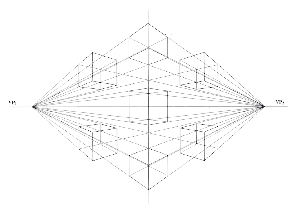
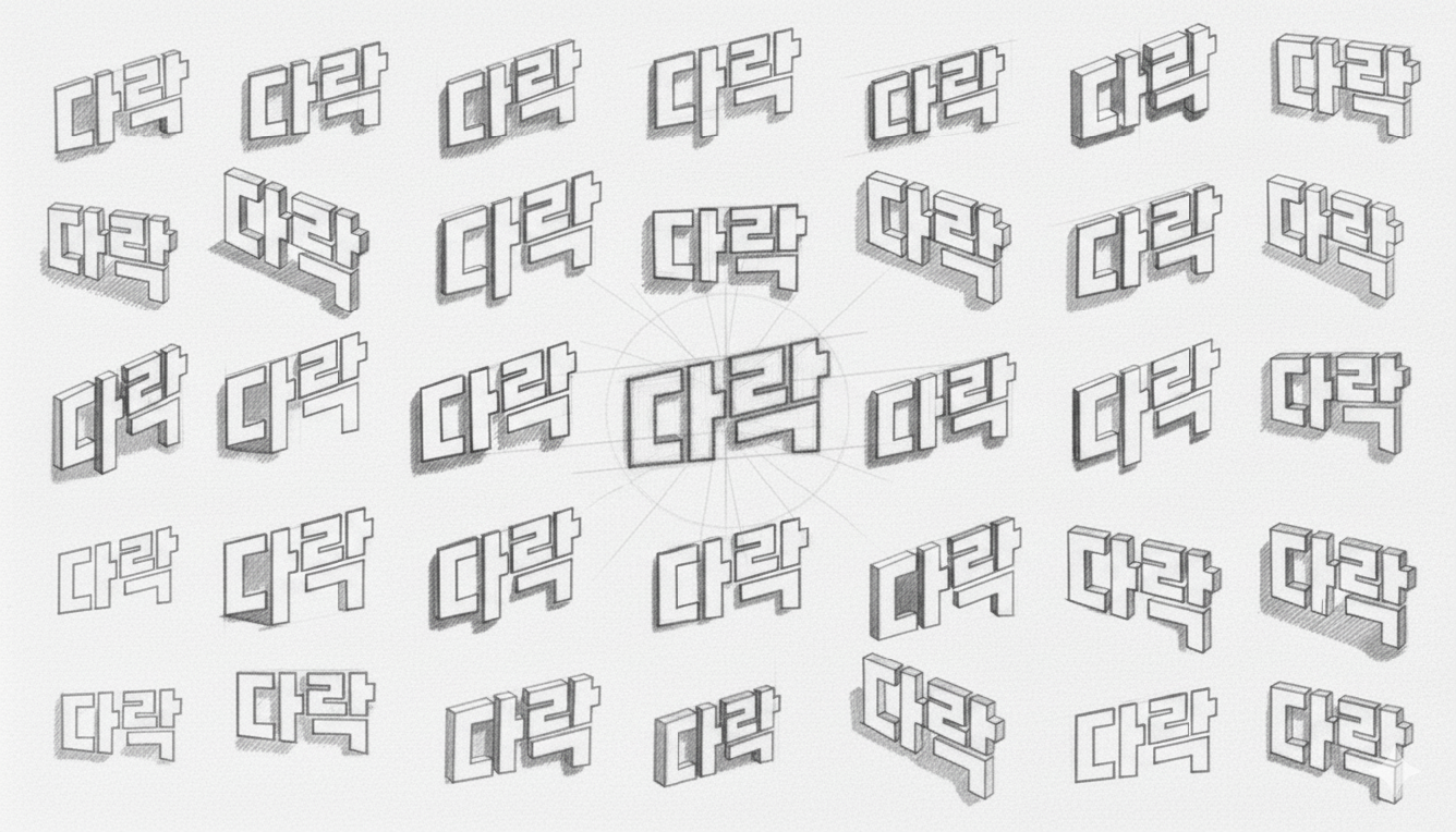
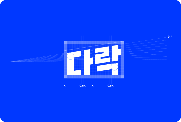
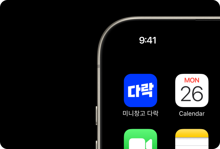
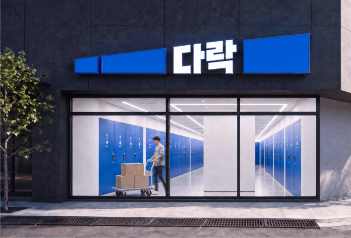
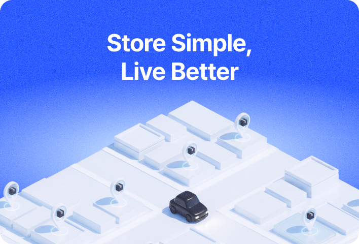
There was no existing design system. The frontend contained more than 100 colors, including dozens of blues. I started by defining the role and state each color should represent. I organized the system into foundations for base values, semantic tokens for meaning, and components for use in the interface. This gave screens a shared logic for applying color by purpose and state. I also used AI tools to help generate and manage tokens. Once I had defined the structure and values, I reviewed them with the frontend developer. We checked for issues such as duplicate states, and the developer implemented the system in the product. This connected the design standards I defined to the code used in production.
Seeing the Whole Service, Beyond the Screen
Over two and a half years as the sole designer, I proposed roadmap initiatives and helped evolve the product. Working across customer experiences and operational admin tools meant considering both how people used the service and what it took to support them. That expanded my perspective from individual screens to the service as a whole.
I also contributed to marketing, branding and positioning. The cost constraints of a physical business meant that not every proposal could move forward, but my input shaped local marketing campaigns that did launch. That experience taught me to consider brand and product together.