From Favorite Brands to New Finds
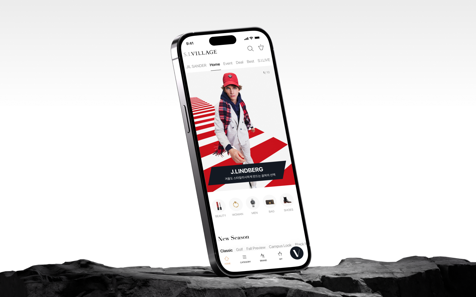
S.I.Village is SHINSEGAE’s premium fashion and lifestyle shopping platform. I joined the service experience (SX) team for a redesign spanning brand identity, services and UX. Drawing on existing research and customer interviews, I helped shape a strategy for shopping by brand, then designed and refined the experience through usability testing.
Why Pay More to Shop Here?
S.I.Village needed a clear reason for customers to choose it. As a later entrant, it had two strengths to build on: exclusive brands and trust in SHINSEGAE. Existing research showed that some VIP customers would pay more for high-value purchases if they could verify the product’s authenticity and official importer.
In focus groups, we also explored how customers shopped on other platforms: what they came looking for, how they browsed and what led them to buy. Favorite brands stood out as an important starting point.
A Brand Worth Visiting. Nowhere to Explore It.
Customers came looking for specific brands, but it was hard to browse their products in one place or move from one item to others from the same brand. Brands brought customers in, yet the experience gave them few ways to keep exploring.
The mostly English brand names and limited filters also made browsing difficult. Recommendations, bestsellers and curated collections looked similar, obscuring their differences. We needed to improve the journey from finding a brand to discovering products that matched a customer’s taste.
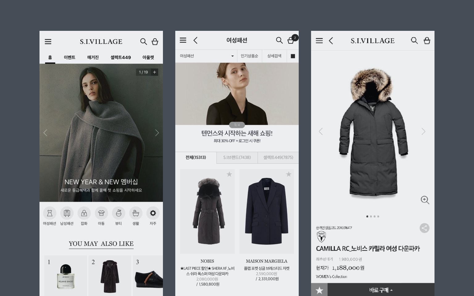
Could Favorite Brands Keep People Exploring?
We believed that helping customers explore new arrivals and styles from their favorite brands could keep a visit going beyond a single search.
Trust in SHINSEGAE gave customers confidence to buy. Browsing needed to support that decision. We connected brands, content and products to make it easier to keep exploring and find something worth buying.
From Brand to Product—and Back Again
Favorite Brands, All in One Place
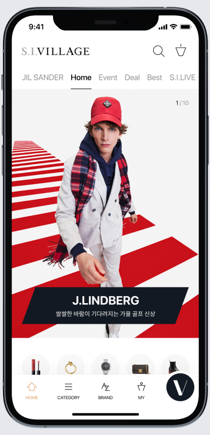
We added a dedicated brand tab so customers could start with a brand and save their favorites. Each Brand Home brought together new arrivals, bestsellers and lookbooks in a magazine-style layout. Whether customers arrived through a brand search or a product page, they could continue exploring more from the same brand.



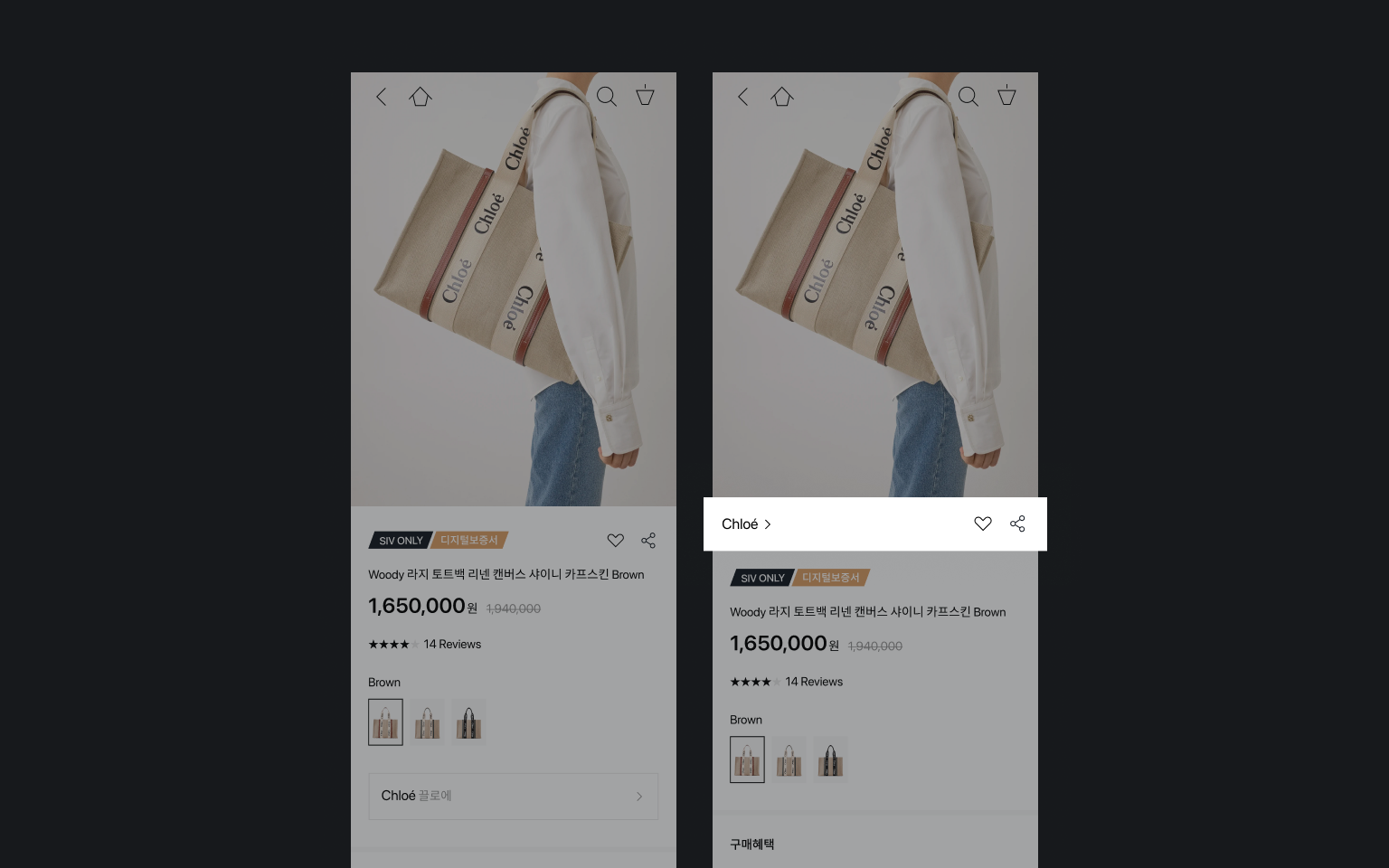
A Brand Link That Looked Like a Coupon
We tested the prototype with three existing customers, observing how they found brands, products and content, then asking about their choices.
Brand search did not work as they expected. They mistook the brand shortcut on product pages for a coupon and did not realize they could tap style content to view its products. These findings guided changes to placement, visual treatment and navigation.
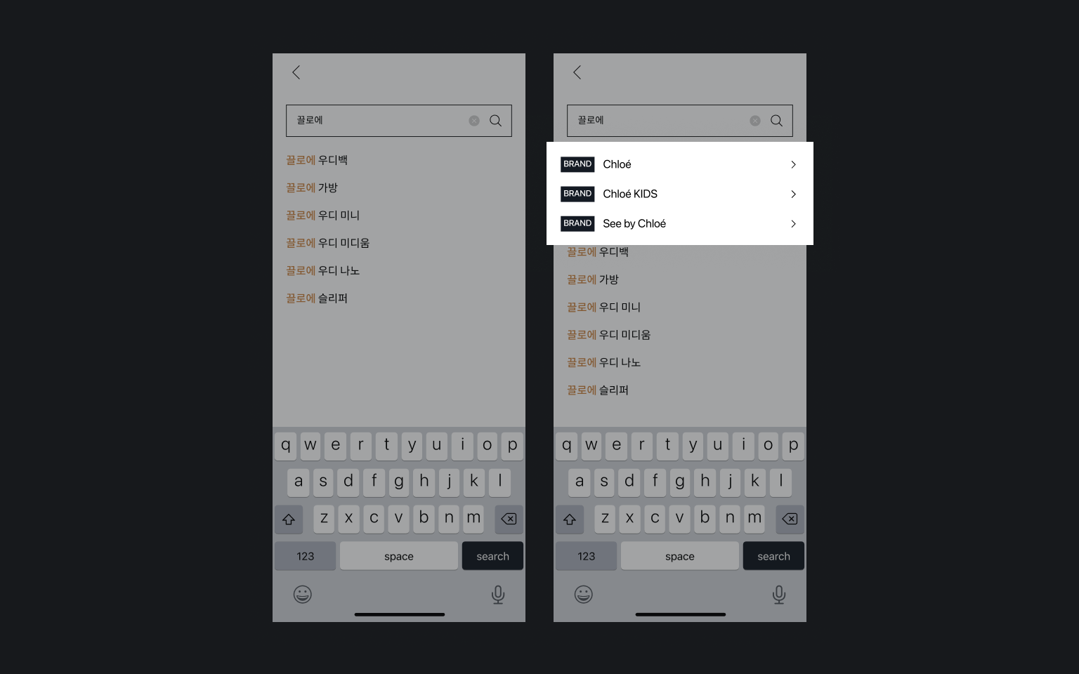
Find the Brand Before the Search Results
Typing a brand name already told us what the customer was looking for. We added a shortcut to the search suggestions so they could go straight to Brand Home without passing through search results.
Like the Product? Explore the Brand.
We changed the placement and appearance of the brand shortcut that customers had mistaken for a coupon. Familiar patterns from other fashion platforms helped us make its purpose clearer: explore more products from the same brand.
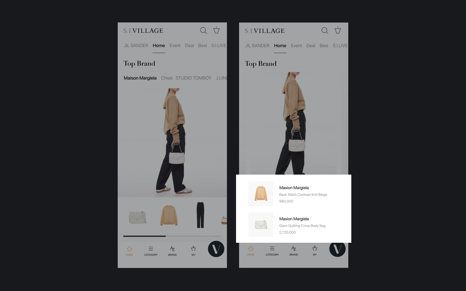
From Liking the Look to Shopping It
Style content caught customers’ attention, but did not lead them to the products. We kept the lookbook feel of complete outfits and added product information alongside the images, giving customers a direct way to explore the featured items.
After the Redesign: 15% More Time Spent, 2× Purchase Conversion
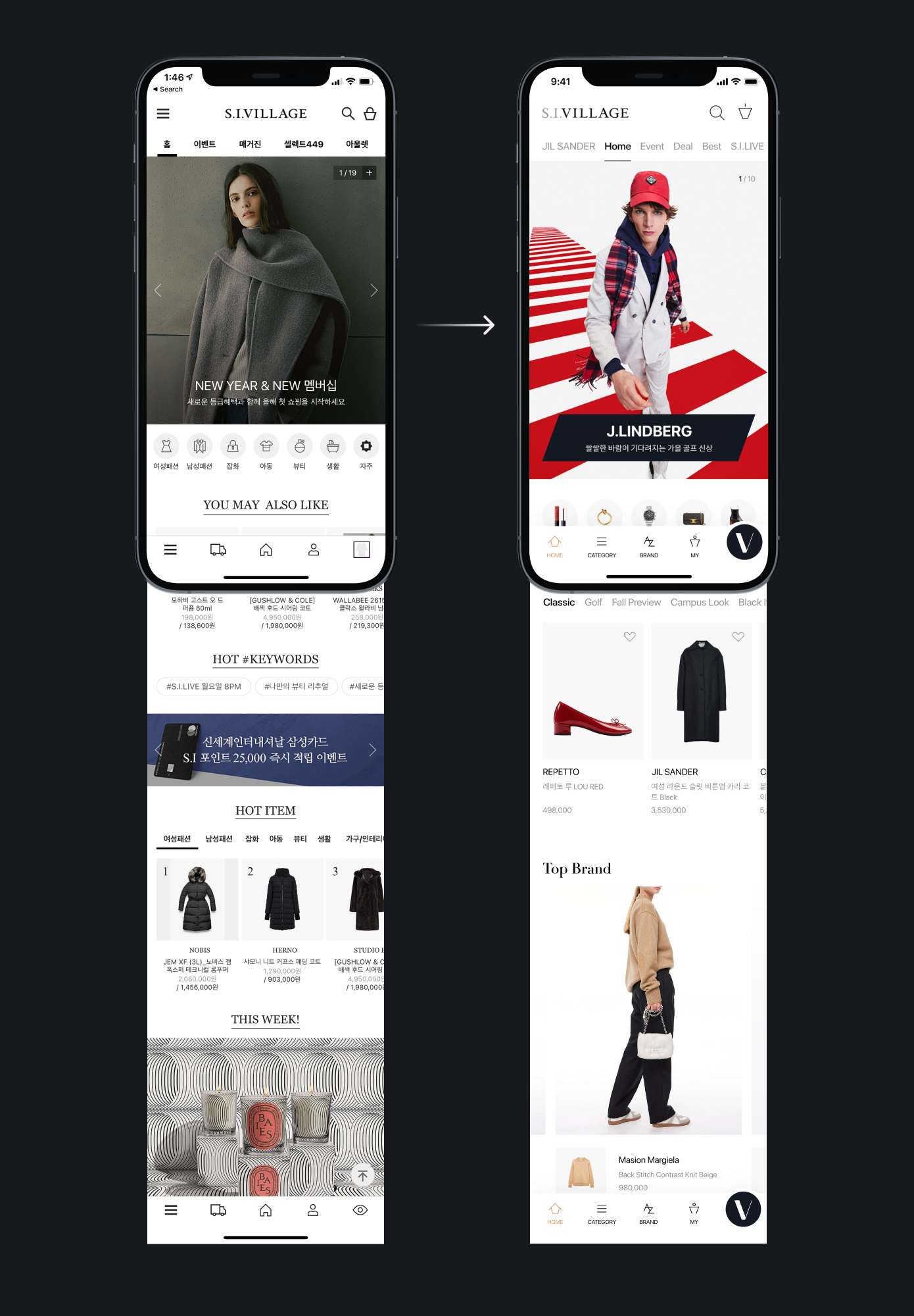
After the redesign around brand discovery, time spent increased by 15% and the purchase conversion rate doubled. These results reflect the broader effort, including rebranding and marketing; the impact of UX changes was not measured separately.
The Starting Point Was Why Customers Came
For me, the value of this project was bringing S.I.Village’s distinct strengths into the way customers shopped. The reasons they trusted and chose the platform helped guide both the brand experience and the UX.